A vibrant blend
of science and beauty.
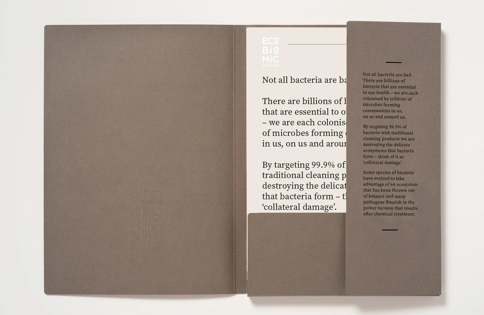
ECOBIOMIC SOLUTIONS
Today’s consumer is more aware of the dangers of chemicals and the benefits eco-friendly products. EcoBiomic Solutions has successfully combined the technological rigor and clinical expertise of their pharmaceutical division with the lifestyle appeal of cosmeceuticals. Our creative approach centered on crafting a timeless, understated elegance that feels modern, luxurious, exclusive, aspirational, and bold.
We sought a visual language inspired by nature—evoking serenity, mysticism, and introspection—a calm contrast to the chaos and harshness of traditional cleaning products. The new watermark logo embodies a fusion of scientific accuracy and the vividness of everyday life. Its fluid design and color spectrum reflect EcoBiomic Solutions’ view of the world as dynamic and vibrant, while offering a fresh interpretation of water and cleanliness.
This watercolor motif extends into the packaging, forming color-blocked backgrounds along the sides that frame key health and brand information. Altogether, the packaging invites moments of calm and beauty amid the noisy supermarket environment. The pairing of strong, clean typography with earth tones and a distinctive watercolor effect on uncoated paper produces a look that is both artisanal and contemporary. The soft gradients and warm hues evoke an inviting, natural atmosphere.
Brand Strategy
Brand Identity
Marketing collateral
Packaging
Website